Dangerous by Design 2022

The most current version of Dangerous by Design is always available at smartgrowthamerica.org/dangeorus-by-design.

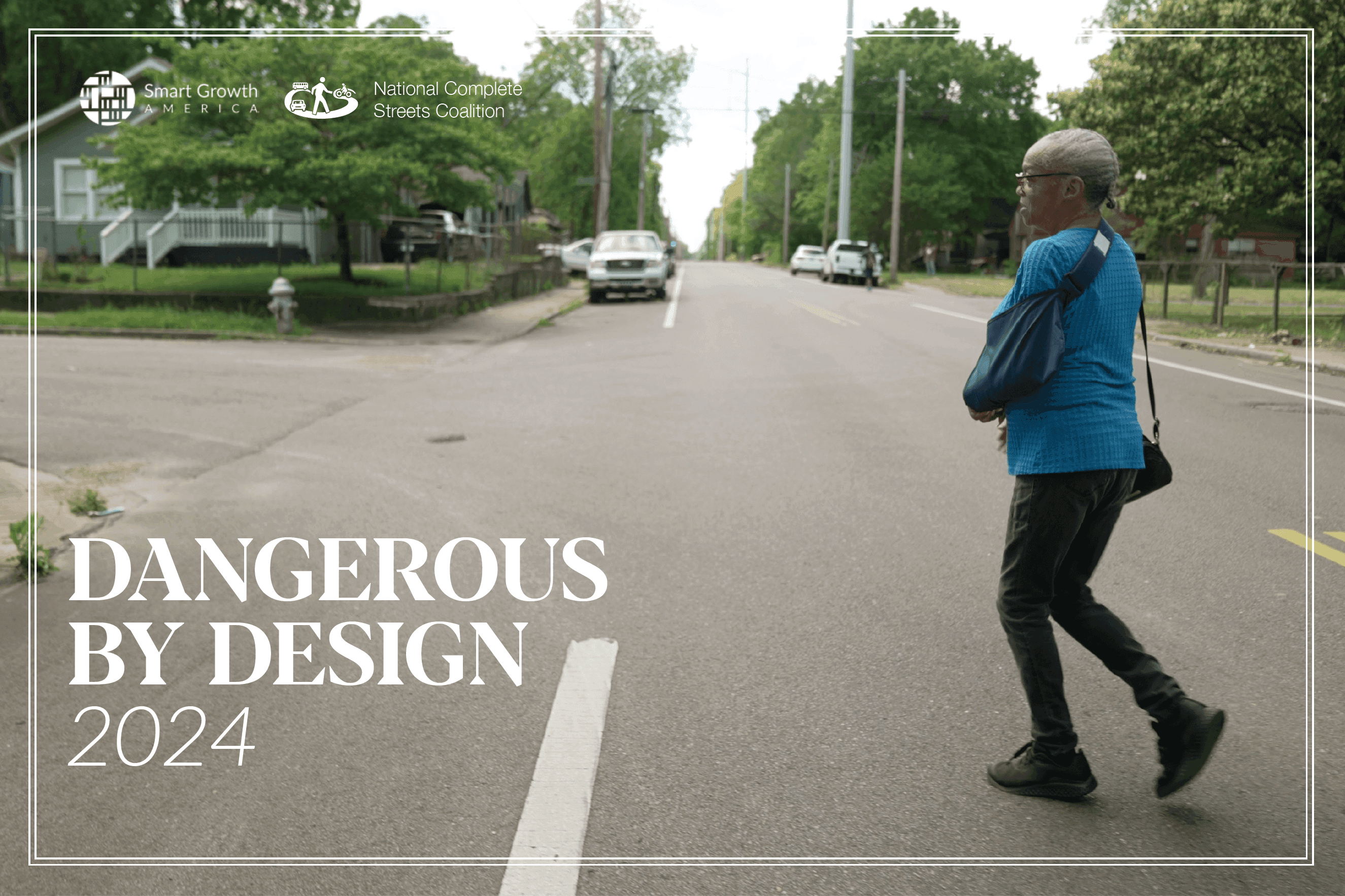
cover image of dangerous by design report. A man steps off a curb in memphis into an arterial road lacking painted crosswalks with heavy traffic passing by

Watch: the report’s launch briefing

On July 28, our staff walked through the findings and, with the help of two special guests, discussed the toll that this crisis is taking on communities and people across the country. Catch up with the full recording and hear from Ken Rose, Chief of the Physical Activity and Health Branch, CDC, Charles Brown, Founder & CEO, Equitable Cities LLC, and Beth Osborne, Vice President of Transportation and Thriving Communities, Smart Growth America.

Quote: this crisis will continue to get worse until those with the power finally make safety for everyone who uses our roads the top priority.

While the unprecedented COVID-19 pandemic upended many aspects of daily life, including how people get around, one terrible, long-term trend was unchanged: the alarming increase in people being struck and killed while walking

The number of people struck and killed while walking reached yet another new high in 2020. More than 6,500 people were struck and killed while walking in 2020, an average of nearly 18 per day, and a 4.5 percent increase over 2019.

This epidemic continues growing worse because our nation’s streets are dangerous by design, designed primarily to move cars quickly at the expense of keeping everyone safe. The result in 2020 was a significant increase in all traffic fatalities, even with less driving overall due to the pandemic.

graphic showing the 62 percent increase in pedestrians deaths since 2009

Dangerous by Design uses federal data that is complete only through the end of 2020, but early estimates from the Governors Highway Safety Association (GHSA) are that 7,485 people walking were struck and killed in 2021. This would be the highest number in 40 years and one of the biggest single-year jumps in decades—between 11 and 13 percent in one year.

The pandemic exacerbated existing disparities

Older adults and people walking in low-income neighborhoods were also struck and killed at much higher rates than other populations in 2020, as with past years.

Although everyone is affected by dangerous street design in some way, this burden is not shared equally. Despite other changes, the pandemic perpetuated existing disparities in who is being killed at the highest rates: Black and Native Americans. 

Graphic showing the disparities of deaths by race


The conditions people face when they want to walk or bike—whether to work or for recreation—are not the same for all Americans. 

Low-income communities are significantly less likely to have access to parks and other opportunities for safe recreational walking and are less likely to have sidewalks, marked crosswalks, and street design to support safer, slower speeds. Lower-income neighborhoods are also much more likely to contain major arterial roads built for high speeds and higher traffic volumes at intersections, exacerbating dangerous conditions for people walking.

bar graph showing the disparities of deaths by census tract income

To reverse these trends and save lives, we need to protect all users of the transportation system through our policies, programs, and funding, while prioritizing the safety of those who are most at risk.

Where are the most dangerous places?

The pandemic’s impact on the data typically used in this report, coupled with significantly higher fatality rates during the pandemic, required a new approach to assess pedestrian danger and address the unique impacts of the pandemic. One effect is that the rankings in this edition are not directly comparable to previous editions of Dangerous by Design. More details are available in the report’s PDF in section III.

map graphic showing where the top 20 most deadly metro areas are

graphic showing the average fatality rate over the last decade for the top 20 most deadly metrosgraphic showing the top 20 most deadly states


For the full rankings of all 101 metro areas and 50 states plus the District of Columbia, please see the “Metro rankings” and “State rankings” tabs at the top of the page. Those tables are sortable and searchable, and include additional fields of data.

graphic showing the decade trend for the top 20 most deadly states. all are getting more deadly over the last decade

What are we waiting for?

Too many agencies and decision makers with a hand in building our transportation system have been asleep at the switch, believing (or just hoping) that safety will improve while only making incremental changes to a deadly status quo.

The result will continue to be ever-increasing and record deaths of people walking and rolling, and we’ll continue in this Groundhog Day loop until those with the power to do so take an active role in making safety for all people the top priority of every dollar spent. To do so, they will have to unwind the deeply embedded, invisible yet powerful emphasis on speed, which is completely incompatible with safety.


Where are the most dangerous streets near you?

This interactive map plots every pedestrian fatality w/ location data from 2008-2020. Search for any U.S. address (or city/state) by clicking on the magnifying glass on the left side of the map.  Tip: It’s often easiest to view this map directly in Tableau here. If the map below appears small on your desktop/laptop, click the second icon from the right on the bottom of the map to convert to a larger desktop view.

Go a little deeper into the data with this more sophisticated look. You can filter by age, race/ethnicity, state and other criteria, and then see a year-over-year chart of fatalities by those filters below the map. It’s often easiest to view this map directly in Tableau here.

These maps were generated using data from the Fatality Analysis Reporting System, provided by the National Highway Transportation Safety Administration.

Note that the totals here do not match the total number of fatalities for each year as several hundred fatalities from 2008-2020 have poor or lacking location data.


Metro-area rankings and data

The tables below rank the most dangerous metropolitan areas in the United States for people walking between 2016 and 2020. As in previous versions of this report, metro areas within the southern half of the U.S. account for a sizable portion of the top twenty most dangerous metro areas in the nation. The top 20 list includes 15 of that region’s major metro areas, including seven from Florida.

  • The metro areas are ranked by the number of deaths per 100,000 people in the population (rate)
  • Tables are sortable by any column
  • This table is also available in the appendix of the full report PDF
RankMetro areaAverage ped deaths/100k people per yearPedestrian deaths (2016-2020)Difference in average daily walking trips, 2019 to 2020*Pandemic change in fatality rate

(avg. 2016-19 vs 2020)
Long term trend in fatality rate

(Five-year averages for 2011-15 vs 2016-20)
1Deltona-Daytona Beach-Ormond Beach, FL4.2514061%0.680.97
2Albuquerque, NM4.1919235%-0.481.91
3Memphis, TN-MS-AR3.9326449%2.151.77
4Tampa-St. Petersburg-Clearwater, FL3.5555950%-0.410.54
5Charleston-North Charleston, SC3.5414056%1.361.57
6Jacksonville, FL3.4426460%0.190.24
7Bakersfield, CA3.4115231%0.060.68
8Orlando-Kissimmee-Sanford, FL3.3743122%-0.720.6
9Stockton, CA3.3512644%-0.741.52
10Fresno, CA3.2516124%1.221.24
11Baton Rouge, LA3.213758%1.540.93
12Palm Bay-Melbourne-Titusville, FL3.139360%-0.390.24
13Tucson, AZ3.1216244%0.771.16
14Miami-Fort Lauderdale-Pompano Beach, FL3.1195434%-0.010.48
14Riverside-San Bernardino-Ontario, CA3.1171635%0.411.02
16Columbia, SC312569%-0.030.5
17Greenville-Anderson, SC2.9713579%0.090.77
18El Paso, TX2.9512434%-1.760.79
19North Port-Sarasota-Bradenton, FL2.9212071%1.150.28
20San Antonio-New Braunfels, TX2.8235447%0.460.43
21Lakeland-Winter Haven, FL2.819971%0.670.48
22Phoenix-Mesa-Chandler, AZ2.868150%-0.160.94
23Cape Coral-Fort Myers, FL2.7810561%0.590.43
24Little Rock-North Little Rock-Conway, AR2.7510271%2.281.01
25Las Vegas-Henderson-Paradise, NV2.6229209%0.030.41
25Jackson, MS2.627858%1.350.37
27Atlanta-Sandy Springs-Alpharetta, GA2.5375243%00.82
27Sacramento-Roseville-Folsom, CA2.5329636%-0.040.74
29New Orleans-Metairie, LA2.4815824%0.140.38
30Louisville/Jefferson County, KY-IN2.4715655%0.360.84
31San Diego-Chula Vista-Carlsbad, CA2.4540720%0.130.57
32Los Angeles-Long Beach-Anaheim, CA2.4158606%0.080.53
33Oklahoma City, OK2.316166%0.50.83
34Birmingham-Hoover, AL2.2812482%0.360.75
35Richmond, VA2.2514448%0.291.09
36Houston-The Woodlands-Sugar Land, TX2.2377951%0.120.39
37Austin-Round Rock-Georgetown, TX2.223943%0.530.44
38New Haven-Milford, CT2.159243%0.970.92
39Baltimore-Columbia-Towson, MD2.1129528%-0.090.43
39Augusta-Richmond County, GA-SC2.116473%1.26-0.13
41Nashville-Davidson--Murfreesboro--Franklin, TN2.0919953%0.90.88
41Tulsa, OK2.0910471%0.140.43
43Urban Honolulu, HI2.06101**-0.530.33
44Dallas-Fort Worth-Arlington, TX2.0476153%0.350.55
44Charlotte-Concord-Gastonia, NC-SC2.0426558%0.40.42
46Philadelphia-Camden-Wilmington, PA-NJ-DE-MD1.9860431%-0.210.22
46Greensboro-High Point, NC1.987657%0.110.31
48Detroit-Warren-Dearborn, MI1.8640146%0.28-0.01
49San Jose-Sunnyvale-Santa Clara, CA1.8418311%-0.040.2
50Portland-Vancouver-Hillsboro, OR-WA1.8322638%0.020.61
51St. Louis, MO-IL1.8225555%0.630.34
52Syracuse, NY1.755740%-0.070.93
53Indianapolis-Carmel-Anderson, IN1.7317756%0.750.23
54Denver-Aurora-Lakewood, CO1.6724535%-0.020.33
54Bridgeport-Stamford-Norwalk, CT1.677942%-0.50.8
56San Francisco-Oakland-Berkeley, CA1.6137804%0.060.13
57Raleigh-Cary, NC1.610954%0.350.2
58Harrisburg-Carlisle, PA1.574545%-1.320.6
59McAllen-Edinburg-Mission, TX1.566765%-0.36-0.08
60Durham-Chapel Hill, NC1.544941%0.21-0.18
61New York-Newark-Jersey City, NY-NJ-PA1.52146820%-0.11-0.09
62Salt Lake City, UT1.519253%-0.570.09
63Knoxville, TN1.496478%0.160.32
63Winston-Salem, NC1.495073%-0.760.11
65Kansas City, MO-KS1.4615768%0.020.31
65Dayton-Kettering, OH1.465956%0.18NA
65Toledo, OH1.464759%0.310.14
65Chattanooga, TN-GA1.464171%-0.280.31
69Washington-Arlington-Alexandria, DC-VA-MD-WV1.4545219%0.20.21
70Colorado Springs, CO1.445356%0.050.56
71Columbus, OH1.4315050%0.10.36
72Scranton--Wilkes-Barre, PA1.413960%0.05-0.16
73Seattle-Tacoma-Bellevue, WA1.3827127%0.320.47
73Virginia Beach-Norfolk-Newport News, VA-NC1.3812240%-0.39-0.01
75Chicago-Naperville-Elgin, IL-IN-WI1.3664439%0.030.3
75Spokane-Spokane Valley, WA1.363848%0.290.28
77Milwaukee-Waukesha, WI1.3110355%-0.370.18
77Hartford-East Hartford-Middletown, CT1.317943%0.03-0.02
79Providence-Warwick, RI-MA1.310546%0.540.17
80Rochester, NY1.296948%0.140.31
81Wichita, KS1.284162%0.160.31
82Cincinnati, OH-KY-IN1.2213557%0.280.36
83Albany-Schenectady-Troy, NY1.25338%-0.52-0.03
84Springfield, MA1.174121%-1.1-0.13
85Oxnard-Thousand Oaks-Ventura, CA1.164940%0.33-0.15
86Ogden-Clearfield, UT1.133878%0.25-0.06
87Grand Rapids-Kentwood, MI1.15965%0.01-0.08
88Cleveland-Elyria, OH1.0811145%0.110.44
89Omaha-Council Bluffs, NE-IA1.065070%0.120.35
90Allentown-Bethlehem-Easton, PA-NJ1.054460%0.33-0.3
91Buffalo-Cheektowaga, NY1.015734%-0.15-0.1
91Boise City, ID1.013763%-0.610.43
93Akron, OH13559%0.010.32
94Boston-Cambridge-Newton, MA-NH0.9623320%-0.09-0.05
95Pittsburgh, PA0.9210743%-0.180.03
96Worcester, MA-CT0.914354%-0.48-0.4
97Poughkeepsie-Newburgh-Middletown, NY0.893051%0.19NA
98Des Moines-West Des Moines, IA0.812870%0.24-0.15
99Minneapolis-St. Paul-Bloomington, MN-WI0.814550%-0.180.17
100Madison, WI0.792652%0.150.06
101Provo-Orem, UT0.571867%0.06-0.18

The pandemic’s impact on the data typically used in this report, coupled with significantly higher fatality rates during the pandemic, required a new approach to assess pedestrian danger and address the unique impacts of the pandemic. One effect is that the rankings in this edition are not directly comparable to previous editions of Dangerous by Design. More details are available in the report’s PDF in section III.


State rankings

The following tables show all data for states, which are ranked by the overall fatality rate from 2016-2020.

  • The states are ranked by the number of deaths per 100,000 people in the population (rate)
  • Tables are sortable by any column
  • This table (with additional data) is also available in the appendix of the full report PDF
RankStateAverage ped deaths/100k people per year Pedestrian deaths
(2016 - 2020)
Difference in average daily walking trips,
2019 to 2020*
Pandemic change in fatality rate

(2016-19 vs. 2020)
Long term trend in fatality rate

(Five-year averages for 2011-15 vs. 2016-20)
1New Mexico3.7639439%0.011.09
2Florida3.22 3,420 48%0.020.49
3South Carolina3.1981172%0.560.82
4Arizona2.98 1,070 53%0.080.82
5Delaware2.8914050%-0.420.04
6Louisiana2.8666853%0.280.62
7Mississippi2.638882%1.190.83
8Nevada2.5839117%-0.010.41
9Georgia2.4 1,261 59%0.290.74
9California2.4 4,729 19%0.130.55
11Alabama2.3256790%-0.330.63
12Texas2.26 3,231 57%0.150.44
13Hawaii2.13151**-0.810.41
14North Carolina2.04 1,060 63%0.170.23
15Oklahoma2.0239978%0.150.53
16Maryland2.0160634%0.170.31
17Tennessee267768%0.670.72
18Arkansas1.9930086%0.860.53
19New Jersey1.9687040%0.030.24
20Oregon1.8137746%-0.130.41
21Kentucky1.840166%0.30.54
22Missouri1.7152472%0.470.38
23Alaska1.659**0.20.26
24Connecticut1.5627845%0.020.45
25Michigan1.5577358%0.20.08
26Colorado1.4842043%0.050.37
27District of Columbia1.449-36%0.01-0.02
27Indiana1.446869%-0.020.27
29Montana1.397464%0.24-0.01
30Virginia1.3758549%-0.10.38
31New York1.35 1,314 21%-0.2-0.18
32West Virginia1.3412169%-0.420.08
33Washington1.3249439%00.34
34Rhode Island1.276741%0.430.23
34Illinois1.2780849%0.140.23
36Pennsylvania1.2680445%-0.170.06
37Ohio1.1868660%0.230.31
38Utah1.1718467%-0.170.03
39Wyoming1.143364%-0.130.24
40Kansas1.1316574%0.560.36
41South Dakota1.074786%0.640.29
42Massachusetts1.0636524%-0.32-0.08
43Maine1.036960%-0.450.16
44Nebraska0.989480%-0.050.32
45Vermont0.9329-5%0.440.04
45New Hampshire0.936366%0.310.25
45Wisconsin0.9326972%-0.090.09
48Idaho0.867570%-0.090.15
49North Dakota0.823165%0.29-0.09
50Minnesota0.8223059%-0.030.22
51Iowa0.7311586%0.160.03

The pandemic’s impact on the data typically used in this report, coupled with significantly higher fatality rates during the pandemic, required a new approach to assess pedestrian danger and address the unique impacts of the pandemic. One effect is that the rankings in this edition are not directly comparable to previous editions of Dangerous by Design. More details are available in the report’s PDF in section III.

How design produces danger (or safety)

Roadway design has a strong impact on how people drive, often more influential on driver behavior than the posted speed limit. While speed limit signs may only be posted every few blocks or miles, the road’s design is ever-present, continually providing guidance and visual cues. While there are myriad factors involved in these deaths, our streets are dangerous by design, designed to move many cars quickly at the expense of safety for everyone who uses them.

Read a longer, more in-depth version of this tab’s brief look at the impact of design:

Learn more


We prioritize speed above safety on the most dangerous roads

Prioritizing both safety and keeping cars moving quickly—outside of limited access roads like interstate and freeways—is impossible. Watch this rich, visual explanation of how street design impacts the speed of vehicles and why we have to choose between speed or safety from Smart Growth America and the National Complete Streets Coalition.

Here’s a typical arterial roadway design

The design of Union Avenue, located in the heart of Memphis, TN (#3 most dangerous metro in this report) is typical of the most dangerous roads for people on foot within metro areas. 60 percent of all 2020 deaths occurred on non-interstate arterial highways like this one. Within urban areas, that number grows to between 64 and 67 percent, according to NACTO. The below graphic examines five ways that speed is prioritized on Union Ave. at the expense of safety, and the contradictory messages sent to drivers: expect to see and yield to people outside of vehicles, and expect to travel fast all the time.

graphic illustrating the design features of union avenue in memphis that make it unsafe and prioritize speed

  1. Design can be more influential on behavior than speed limits. Though the limit ranges from 25-35 mph, this road is designed for much higher speeds. It’s long and straight, with clear sight lines and five travel lanes for maximum vehicle throughput, resulting in higher speeds. And though the speed limit changes, the design never does.
  2. Other streets regularly intersect Union, but lack crosswalks or signals, because keeping vehicles from stopping (speed) is prioritized ahead of providing frequent crossings (safety). There are also numerous curb cuts and driveways, resulting in dozens of intersections for people walking.
  3. Numerous destinations means that more people will be present. There are grocery stores, a college, a high school, a hospital, shops and stores, and hundreds of homes and higher density apartment buildings.
  4. Marked, signalized crosswalks are located as much as 0.4 miles apart, potentially requiring a 10-minute round trip to reach a destination that’s directly across the street. Multiple bus stops are also located in between these distant signalized crosswalks.
  5. Sidewalks exist, but as an afterthought. They are narrow with numerous curb cuts for turns and frequent obstructions, and no buffer between people walking and vehicles moving at high speeds.

Most fatalities on Union Avenue occur at intersections

This graphic below, looking at a specific intersection on Union Avenue, shows four specific design components that lead to danger for people on foot, some of which exist solely to prioritize speedy car travel.

  1. All four gently rounded corners allow right turns at high speeds, precisely when pedestrians have the right-of-way. Sharper turns require drivers to slow down and turn more slowly. In fact, a recent study shows that a 30-foot turning radius vs. a 10- foot radius will probably result in 30 percent more pedestrian crashes.  (See inset at bottom right.)
  2. These sweeping corners—which exist for speed rather than safety—increase the distance required to cross on foot, putting people in harm’s way for more time, or making it impossible to cross in time for the young, old, or disabled.
  3. Existing crosswalks are faded or invisible. When signalized intersections are far apart, as they are on Union, it’s even more vital that they be highly visible.
  4. Sidewalks also have obstructions (utility poles, boxes, etc.) and lack rubberized or high-visibility markings to help all people safely cross. For people in wheelchairs or pushing strollers, sidewalks with obstructions can force them into the street to pass.


graphic showing design features at an intersection on union avenue in memphis that produce danger for people walking


Read this Dangerous by Design supplement from the National Association of City Transportation Officials (NACTO) for specific how-tos on designing and building safer streets through design.

Read this Dangerous by Design supplement from Strong Towns about how traffic engineering is part of the problem

Learn more from four other organizations

We are honored to include four special topical supplements in this year’s report. You can find all four in the report PDF, but all are also available here. Click any to read these short guest supplements about Dangerous by Design from a different angle from these four organizations:

Strong Towns: Traffic engineers do not share your values (pp. 13-14)

The National Association of City Transportation Officials: How to redesign your city’s most dangerous streets to save the most lives (pp. 19-21)

America Walks: When it comes to design, we must also consider the deadly impacts of ever-larger vehicles (pp. 24-25)

The Fines and Fees Justice Center: Traffic enforcement cannot do the job of better roadway design (pp. 37-38)

The Centers for Disease Control and Prevention provided support for data analysis and synthesis used in the report under cooperative agreement OT18-1802 supporting the Active People, Healthy NationSM Initiative, a national initiative led by the CDC to help 27 million Americans become more physically active by 2027. Learn more: https://www.cdc.gov/physicalactivity/activepeoplehealthynation/index.html. The findings and conclusions in this report are those of the authors and do not necessarily represent the official position of the Centers for Disease Control and Prevention.