


News
By Sam Warlick, August 29, 2014

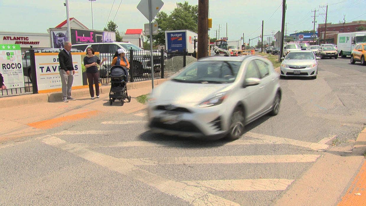
Pedestrians walking in the Atlanta metro region. Photo via Flickr.
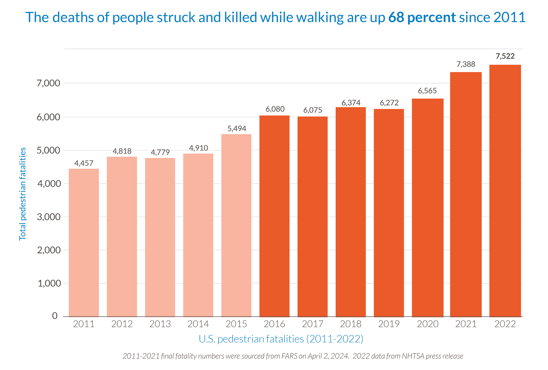
Pedestrian deaths are a national epidemic in the United States. Within that epidemic, though, some populations have been hit harder than others.
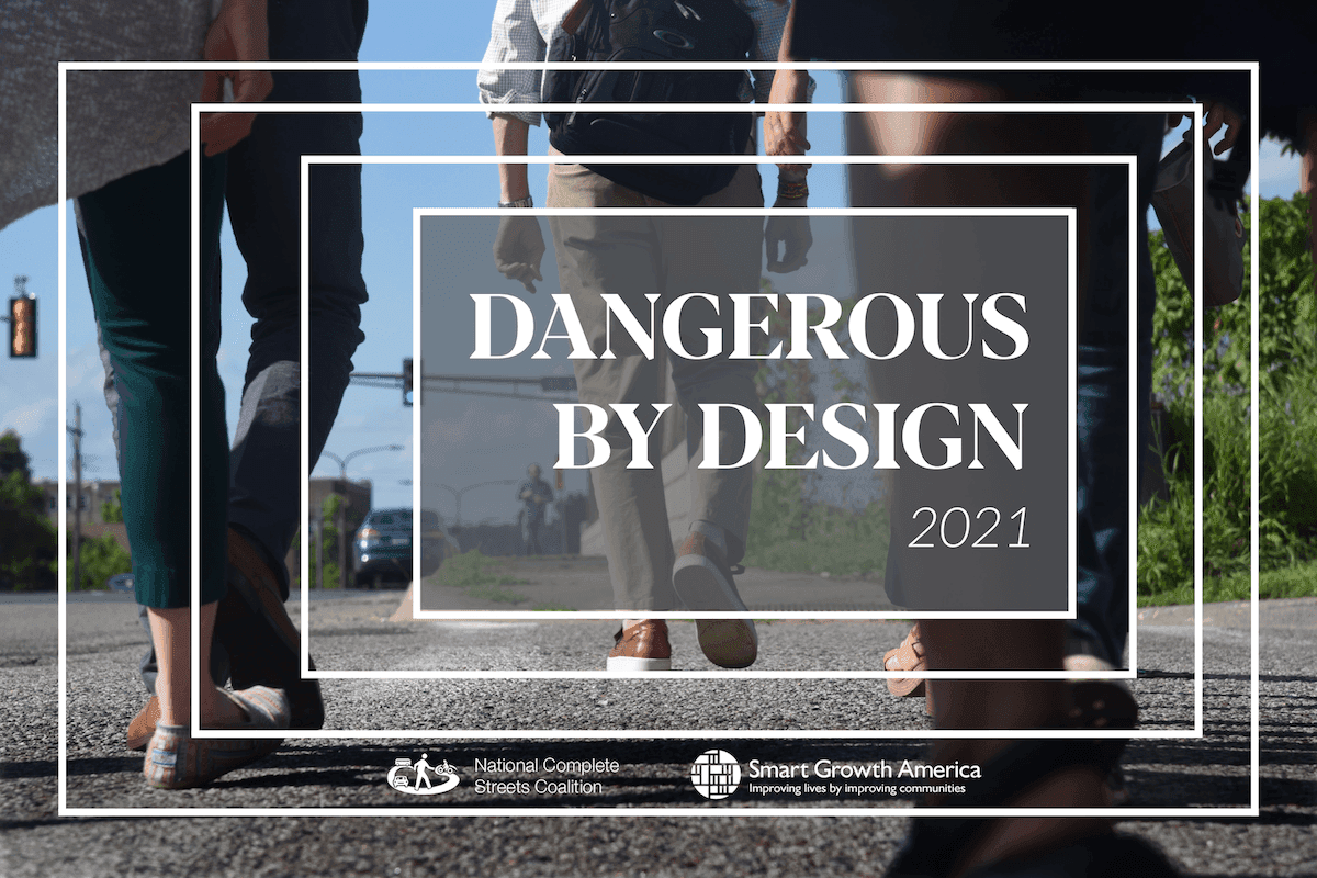
In Dangerous by Design 2014, we ranked America’s most dangerous metropolitan areas for walking using our Pedestrian Danger Index (PDI). We investigated the nature of over 47,000 pedestrian deaths from 2003 through 2012 and identified the regions that most needed to improve pedestrian safety. In more recent years, many of them, including the Florida Department of Transportation, have started taking steps to keep people on foot safe.
But our analysis of demographic data, included in the report from a state-by-state view, also told a story of inequity.
Across every state where the data was available, we found that people of color were far more likely to be struck and killed while walking than non-Hispanic Whites. On a per capita basis, black people and African Americans suffered fatalities at a 60 percent higher rate than their white counterparts, while Hispanic people had a 43 percent higher rate than non-Hispanic people. American Indians had the highest risk factor of all with a national average of 5.87 pedestrian deaths per 100,000—almost triple the rate for non-Hispanic Whites.
Though the disproportionate fatality rate for people of color spanned state and regional lines, some areas were far worse. In South Carolina, the fourth most-dangerous state in our rankings, African Americans were twice as likely to be struck and killed, and Hispanic individuals faced almost triple the average risk. Meanwhile, in Arizona, ranking eighth overall, American Indians suffered pedestrian fatalities at an astonishing rate of 16.62 deaths per 100,000 people—the highest for any demographic group, anywhere, and over eight times the rate for white non-Hispanic people in the same state.
Dangerous by Design 2014 proposes a number of explanations for why people of color are so disproportionately represented among pedestrian deaths. For one, American people of color travel on foot at a higher rate than white people, resulting in greater exposure to pedestrian injury—especially in the nation’s most dangerous cities and corridors. But the effect is relatively minor. For example, on average, black and African Americans make only three percent more of their trips on foot than Whites.
Another explanation is that African American, Hispanic, and Native American people are more likely to live in regions typified by busy arterial routes and longer distances between destinations. The majority of all pedestrian deaths occur along these major roadways, which are often planned and engineered for driving at high speeds rather than for the variety of people—young, old, with and without disabilities, walking, using transit, and bicycling—who use them.
While such arterials can be found in neighborhoods everywhere, they are most common in areas where homes are located far from schools and where office parks and strip-mall development are typical. More compact neighborhoods with frequent street connections tend to suffer fewer pedestrian fatalities. (Our online map of pedestrian fatalities highlights some of the worst areas.)
Many people of color also live in neighborhoods that traditionally have not gotten the investment that wealthier, whiter neighborhoods have. In the mid-20th century, the homes of low-income families and people of color were often razed under the guise of “urban renewal” and the progress of the interstate highway system, pushing these communities to the fringes and to sprawl where thoughtful pedestrian infrastructure design is, at best, rare.
This explanation is corroborated by a new study released this month by Governing magazine, which found that pedestrians are indeed killed at disproportionately higher rates in the nation's poorer neighborhoods. The authors of that study proposed similar reasons: poor street design, poor speed enforcement, inadequate transportation options.
Many communities in the most dangerous metro regions identified in Dangerous by Design 2014 have begun to take steps to improve safety, but the higher risk people of color face runs through almost every state.
It’s one more reason why every community, from the top of our rakings to the bottom, should take Dangerous by Design 2014 as a wakeup call—and why the only acceptable pedestrian fatality rate is zero.
Related News


Livable places. Healthy people. Shared prosperity.


© 2026 Smart Growth America. All rights reserved
Site By3Lane Marketing
